Sunday, October 24, 2010

Module 5: The Genesis of Twentieth Century Design

'The Art of the Poster,
is the Art of Suggestion'
John Hassall poster designer, c1916 

Today I am learning about posters, advertising, and London Underground.


Original drawing for the London Underground roundel symbol
Design: Edward Johnston © TfL/London's Transport Museum


The Textbook Chapter 12 ended with Design for the London Underground. I thought this was interesting because we have been studying all these willowy, curvy, new designs and the contrast to the London Underground design is startlingly. The reason was a good one. Frank Pick wanted the posters and signage to jump out amid all the advertising clutter. He understood early that you had to set yourself apart. This is a clear indication of 20th century marketing. Before posters were "predominantly text based and failed to convey a coherent corporate identity."

Frank Pick (1878-1941)
Design Patron

Frank Pick

I found London Transport museum's website and they have the posters on a time line from the 1900's to the present day. Absolutely fun surfing the hundreds of posters and by so many different artists. I have posted a few below. Go check them out. Pick sure knew what he was doing. Now I understand why the textbook included this section for our study.

"London Transport’s annual poster programme has always been diverse. This was necessary in order to appeal to such a broad audience. However, every decade in poster history demonstrates key stylistic developments." http://www.ltmcollection.org/posters/dates/dates-main.html

This poster by John Hassell, marked the beginning of London's underground poster program.

No need to ask a p'licemanJohn Hassell, 1908No need to ask a p'liceman

"This was the first pictorial poster commissioned by Pick for the Underground. The bold graphic design contrasted sharply with the wordy layout of earlier transport posters. Hassall, an established and popular commercial artist, was an excellent choice to launch the new approach."
'The Art of the Poster, is the Art of Suggestion'
John Hassall poster designer, c1916 

Now compare that with the one one below. This was the style before Pick took over. So you can see the message is so much clearer with a simple visual rather than lots of text. Oh, by the way, he got this part of his job by complaining about the advertising.

Always ask for tickets by District route 
Always ask for tickets by District route, by unknown artist, 1901

"Pick organised commissions directly with artists and illustrators. He approached skilled and respected practitioners of their day, but also younger, lesser-known artists. In 1915, Pick spotted the talent of Edward McKnight Kauffer, who went on to dominate the British poster art field." Below is one of Kauffer's first posters and he continued all the way to 1974 designing posters for the Underground.

The North Downs
The North Downs, by Edward McKnight Kauffer, 1915


A few random ones:
1900's                           1910's                             


Image of a Poster; No waiting; rapid service of trains, by Charles Sharland, 1909Image of a Poster; Southend and Westcliff-on-sea, artist unknown, 1908Image of a Poster; Edgware for walks, by Charles Sharland, 1913Image of a Poster; Guy Fawkes day, by Charles Sharland, 1911

Image of a Poster; While others wait; a season takes you through, by Percy Drake Brookshaw, 19271927

War time posters World War I
1209 Men of these Companies have joined The ColoursRecruitment; warWar - To Arms Citizens of the Empire
Image of a Poster; Air raids, by unknown artist, 6 September 1917.

Image of a Poster; Gas put on your mask, artist unknown, 1941 Back room boys, they also serve; traffic control Roll of honour


Artwork:


Finished Poster:

The land of nod (a reminder of home), by Charles Sims, 1917


All quotes & graphics from http://www.ltmcollection.org/posters/index.html unless indicated.

Saturday, October 23, 2010

Module 5: Art Nouveau


"To the age its art. To the art its freedom."

Motto of an era-from over the door of the Secession Building in Vienna:


From Huntington Library website:
Considered the first manifestation of the Art Nouveau movement, only one other of the richly carved chairs by Arthur Heygate Mackmurdo is known to exist in the United States.

mackmurdo2
mackmurdo4


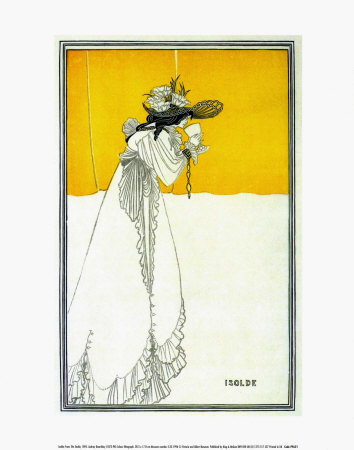
This poster by Beardsley clearly shows the Ukiyo-e influence. Asymmetrical layout, willowy lines,  Japaneses like feeling, and the use of the large area of color with the rest of the space empty.

Isolde

by Aubrey Beardsley


Here is the cover of "The Yellow Book" we read about in our text.


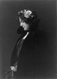
Ethel Reed (1876-?)

EthelReed.JPG

http://en.wikipedia.org/wiki/Ethel_Reed

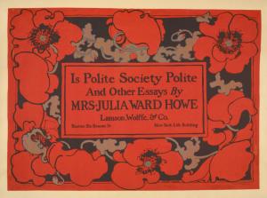
Below are a couple of samples of her work. What happened to her?


  • Gertrude Smith, The Arabella and Araminta Stories (Boston: Copeland and Day, 1895)


  • Is Polite Society Polite?

    The following shows a collection of her works. Her last poster was done when she was only 22.
    http://digitalgallery.nypl.org/nypldigital/dgkeysearchresult.cfm?word=ethel+reed&c=212&sScope=Collection+Guide&sLabel=Turn%2520of%2520the%2520Century%2520Posters


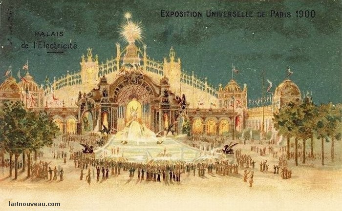
    The 1900 World Fair
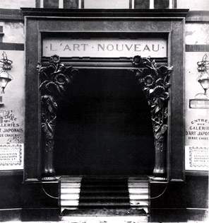
    Art Nouveau was prominently displayed and define the age of 1890 to World War I. Below is a poster and a post card, I think, and shows the elements of this style. Go to the site http://lartnouveau.com/ to see slide shows of illustrations, architecture and other information such as the artists from each country that best represents the movement. Be sure to translate to English (click on British Flag.)

    L'ART NOUVEAU
    Boutique de Siegfried ("Samuel") Bing 1839-1905
    22, rue Chauchat  Paris 
    ouverture en décembre 1895 
    phrase borrowed from the Belgian founding
    de la revue " l'art moderne " 1881 of the magazine "Modern Art" 1881
    Oscar Maus et Edmond Picard Oscar Maus and Edmond Picard


    Sample of Art Nouveau Type style:   "The newly discovered Art Nouveau plaque is embedded in a dirty wall in the 59th Street subway station. The blue-and-white plaque was once part of a gallery maintained by the architects Heins & LaFarge for the purpose of testing decorative ideas."
    http://www.nytimes.com/2007/11/02/nyregion/02plaque.html?_r=2&oref=slogin


    Tuesday, October 19, 2010

    Module 4: The Arts and Crafts Movement and Its heritage

    Power phrases from the movement:
    Cheap and Nasty-a phrase by Carlyle
    The "soulless" machine. -unknown
    “Quality is never an accident; it is always the result of intelligent effort.” Ruskin

    The heritage of the Arts and Crafts movement was a desire to do well the craft. Whatever they were designing or making, do it well, do it better, do it to last. It was a return of the craftsmen and a desire to celebrate true luster of beauty. The result was eventually all benefited from its ideals as goods were better made. The standard was raised and was demanded. We are still demanding.

    One more sample:


    Teaching sheet: 'After Winchester formal writing about 975 A.D.' 'gaudere autem ...'Demonstartion sheet of the letter 'a' by Edward Johnston
    Samples of Edward Johnston's calligraphy. This shows how meticulous the work  is for the calligrapher and the pride of it. "Demonstration sheet by by Edward Johnston, '56 a's made as wrongly as possible', 1931. Two pages on paper, written in a massive foundational hand in blue-black ink. Annotations are written in an italic hand in red ink. This page shows 24 a's."

    "In a tribute to her father given at the Art Workers' Guild in 1945, Bridget Johnston mentioned how "few .. were more acutely aware than he of how the order in which a thing was done affects the thing itself. He calculated that there were no less than 56 different ways in which the ordinary Small-letter a could be made, according to the order in which the strokes were written, only one of them being the correct way"."
    http://archiveshub.ac.uk/features/ditchlingcraftcommunity/edwardjohnston-demonstrationsheet.html
    http://archiveshub.ac.uk/features/ditchlingcraftcommunity/edwardjohnston-teachingsheet.html

    Module 4: Random stuff


    Artist: C. B. Gifford - A.L. Bancroft & Co.
    I was surfing and a mention was made of this lithograph in a book "Views and viewmakers of urban America: lithographs of towns and cities in the United States and Canada, notes on the artists and publishers, and a union catalog of their work, 1825-1925", by  John William Reps. It's San Jose in 1875. The book was explaining the process of lithography and in using this lithograph of San Jose as an example that the color grey is seen as green by the eye.

    Source of picture & book: http://en.wikipedia.org/wiki/File:San_jose_california_1875.jpg
    http://books.google.com/books?id=3mI1wvk_o3cC&printsec=frontcover&dq=%22Views+and+viewmakers+of+urban+America:&hl=en&ei=VnG-TNa6CY6isAO54tziDA&sa=X&oi=book_result&ct=result&resnum=1&ved=0CDAQ6AEwAA#v=onepage&q&f=false


    File:Kelmscott Press Typefaces Detail.jpgThe Kelmscott Press trademark with samples of the three type styles Morris is known for. If you look closer at the photo, you will see the beautiful letterpress indents and watermark. Gorgeous!


    Currier and Ives lithograph, 1874
    "Printmakers to the People" was their motto. The firm of Currier and Ives described themselves as "Publishers of Cheap and Popular Prints." I found it interesting that the textbook sometimes focuses on the unusual or expensive. Sometimes the popular represents more people than the expensive. This company was barely mentioned (one line on page 157 that they went bankrupt.) They did not do the illustrations themselves but had others do them (that was a new fact I learned.) Nevertheless, their images caught the everyday scenes of life. The Rockwell of their day. Read their history to learn more.
    http://www.philaprintshop.com/currhist.html


    Arts and Crafts Movement, Luc Devroye, School of Computer Science, McGill University, Montreal, Canada
    Different tidbits of people today being inspired from the Arts and Crafts era and some history.
    http://cg.scs.carleton.ca/~luc/artscrafts.html

    Module 4: Graphic Design and the Industrial Revolution

    
    This chapter was well, a journey through time that I know my printer father would have loved to take with me! I enjoyed learning the different styles of the beginning 19th century & the Victorian era. I think that we sometimes "complain" about the clutter of Victorian design but we have to remember where they were coming from. For the first time in History, masses of people had things. Their floors were covered instead of hard packed dirt for example. They could purchase items that used to be just for the rich like books because of mass reproduction. They wanted to show their things off.  They were proud of their processions that their ancestors did not have access to. That is my personal opinion of why they loved "clutter."

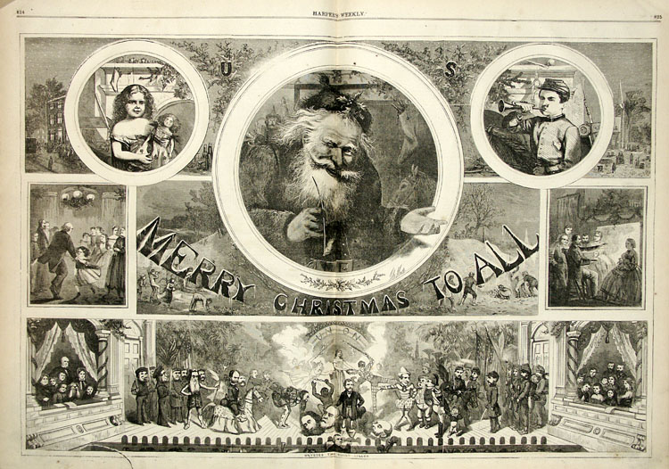
    I was curious about Thomas Nast and how his Civil War sketches helped win the war according to General Ulysses S. Grant so I looked him up. His sketches are incredible! Found  http://www.sonofthesouth.net/Thomas_Nast.htm:  Here are a couple of samples:
    
    Thomas Nast: Emancipation
     I Love the detail  of his drawings and during this time frame, people loved the ornate and very cluttered look (Victorian). The textbook pointed out why posters are cluttered and it was because people had more time to look at them; a slower pace lifestyle. So I imagine that the same holds true of these kinds of illustrations.


    He also created the political symbols for the political parties, the Replublian elephant and the Democratic donkey.


    Here is his Santa Claus. He is credited with created our modern concept of Santa Claus. I think these illustrations represents the best of the age, Family, cheerful optimism, and all is well here attitude. His use of each area of space is unbelievably controlled and gives much information to "tell a story."

    Sources:

    Tuesday, October 12, 2010

    Module 3 A Graphic Renaissance-Miscellaneous

    As I spent time exploring and with my desire to add everything, I knew I needed to stop and think. Why did we go so fast in this section of the book? I just couldn't explore it all! I would love to have had a week per chapter.
    I looked at William Blake's Illustrations at http://www.blakearchive.org/blake/ and could see the next stop on our path  to that romantic era with its many sweeping swirls and not clear lines. I like these two pages from his "Book of Job." He draws so the eye goes directly to the main center but all the other designs add to the visual bounty. The lines ,almost spidery, seem to accent the timeless of the story and how he adds it as part of the illustration. He is able to have the engravers lines but have it look painting wash effect on his color illustrations. Amazing.

    I also went to other sites such as
    http://www.britannica.com/EBchecked/topic/611830/typography/36786/History-of-typography to see a modern day model of Gutenberg's type mold. And to http://wapedia.mobi/en/History_of_western_typography that had a great book of a piece of cast metal type of Garamond's style long s along with a history. The open library at http://openlibrary.org/subjects/time:conquest_1519-1540 has a great collection of digital books from the early 1500's. Sites about paper making was on my list to do. I wanted to look up each craftsman and explore his works.
    My thoughts are with all the people that over this long period of time were able to produce such a tremendous amount of work and that work were things of beauty with utility. How hard they worked with patience and loving care. How they built upon the previous generation of innovation and put in their own uniqueness. Sure some made a handsome profit and a living but what craftsman they were.

    Many were part of family dynasties with a widow marry the head foreman to keep the shop going. They were human like Geoffroy Troy's pot casse emblem which was symbolic of his daughter death. So are we just a hard working and just a hungry for knowledge? I think we are. We have built upon their legacy and with our improvements, all can see their works.


    Module 3: Movable Metal Type Printing and Jikji-oldest known sample-Module 3


    This YouTube is showing that Korea had the oldest book made movable type. We know that it didn't influence Western at the time it was published but it show that the idea had been around. The video does point out that the idea probably originated from the East. It must be remembered that many factors were needed to have a the explosion of mass reproduction. Gutenberg found a way to pull all the different technologies together into one workable and reproducable system. It took him over 10 years to experiment and 20 years to produce the Bible. Poor man didn't even profit from it.

    Ideas can occur to people at the same time as another. They may have been influenced by the time they lived. Haven't any of you think of a great idea and then it's on the market soon after that? We didn't influence the person who actually took the idea to market but we both thought of the idea at the same time. This may be what happened to Gutenberg and how he was able to create his ideas. He was a time of great demand for books. People wanted to learn. He was in the moment and he actively thought about the problems confronting him. Then he went out and solve them. Because he did, we are who we are today. I greatly admire his patience and fortitude.

    Module 3 A Graphic Renaissance

    I Love the red ink of the printers mark on this  colophon published in 1489. (title: Biblia Latina cum postillis Nicolai de Lyra et expositionibus Guillelmi Britonis in omnes prologos S. Hieronymi et additionibus Pauli Burgensis replicisque Matthiae Doering). The lines are strainght, vertical, and easy on the eyes with wide margins.


    Source University of Washington, special collections

    Module 3 A Graphic Renaissance: Sample of paper, watermark & woodcut

    
    Letterpress on handmade laid paper
    This is an excellent example three items.
    1. LAID paper that the textbook talked about. See the ridges?

    2. WATERMARK-see how the paper is thin where the
    watermark is? I don't know if this is the printer's trademark.

    3. WOODCUT ILLUSTRATION-good clarity & shows the style of the times.

    Archimedous, an early Greek mathematician. This is an example of reproducing classic works. Printed in 1544.


    Title: Archimedous tou Syrakousiou, Ta mechri nun sozomena, hapanta. = Archimedis Syracvsani philosophi ac geometrae excellentissimi Opera. quae quidem extant, omnia, multis iam seculis desiderata, atq[ue] a quam paucissimis hactenus uisa, nuncq[ue] primum & Graece & Latine in lucem edita. Quorum catalogum uersa pagina reperies. : Adiecta quoq[ue] sunt Evtocii Ascalonitae in eosdem Archimedis libros Commentaria, item Gaece & Latine, nunquam antea excusa
    Source: University of Washington, Special Collections

    Module 3: A Graphic Renaissance

    This is my first post to my blog about the History of Graphic Design. I am learning so bear with me. I was surprised about the the lack of choices for fonts. I love to use different ones.

    This week we breezed through 4 chapters on history from the late 1400's to the 1800's stopping just before a discussion on the Industrial Revolution. Next will several posts on this time frame starting with a exquisite example of a watermark.